How to Optimize Landing Pages for Social Media Ads – 5 Design Strategies for Higher Conversions
Your ads on social media can be worth their weight in gold – but if the landing page doesn’t deliver what the ad promises, the conversion rate is usually still subterranean. In this article, we look at why this is the case and how you can optimize your social ads landing pages so that conversions go through the roof.
You will also find out,
- what exactly social media ads, landing pages and conversions are
- why the interaction between ad and landing page is so important
- which design strategies you should use for a conversion-optimized landing page
- how you can measure the performance of your landing page
What are social (media) ads, landing pages, and conversions? An explanation of terms
A social ad is a paid advertisement on social networks such as Facebook, Instagram, TikTok, or LinkedIn. The aim is to reach a specific target group. Social ads can have different formats such as images, videos, or carousel ads.
A landing page is a separate subpage on a website that people “land” on after clicking on a social ad. It is designed to encourage users to take a specific action, such as booking a consultation, buying a product, or entering contact details in a form.
Conversion (rate) is the conversion rate of those visitors who perform the desired action on the landing page. The basis for ensuring that the landing page converts satisfactorily – i.e. generates the targeted number of consultations, product purchases, or contact data – is the graphic and textual design of the social ad.
The conversion rate is calculated from the number of actions taken (to stick with our examples: booked consultations, product purchases made, contacts registered) divided by the number of ALL visitors.
Let’s assume that 100 people visit your landing page every day, 30 of whom convert (i.e. carry out the desired action). Your conversion rate is therefore 30 percent.
As a formula: 30/100 = 0.3 x 100 = 30 %
Social ad and landing page: Why the interaction is so important
Imagine the following scenario: An ad on social media entices you with melt-in-your-mouth chocolate with a velvety texture, aromas of gently roasted cocoa, and a hint of vanilla, the picture looks tempting to bite into, you click on the CTA button full of anticipation … and then on the landing page they want to sell you broccoli.
Your enthusiasm is limited, isn’t it?
This is precisely why it is so important that the social ad and landing page go hand in hand and that the landing page primarily fulfills the following three points:
- It must link seamlessly to the call-to-action button of the social ad. Otherwise, the enthusiasm, excitement, or curiosity built up in the ad will immediately fizzle out again.
- It must fulfill the “promise” made in the social ad, anything else confuses, unsettles, or annoys users – and they will leave your site faster than you can say hello.
- It must be optimized for mobile devices because most people scroll through social media and click on an ad on their cell phones. If the user experience on the landing page is suboptimal, people will leave immediately.
Two examples of successful interaction between social ads and landing pages:
Example #1: Office furniture manufacturer Hali
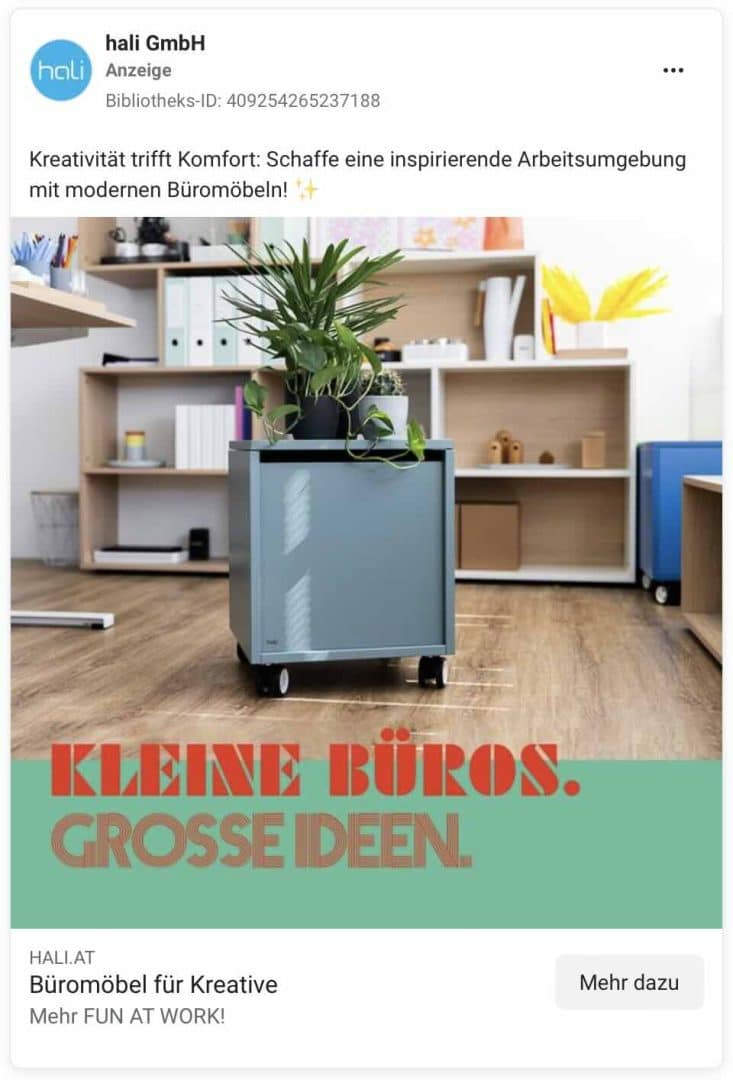
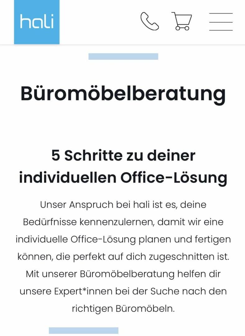
This German ad promises big ideas for small offices, the landing page offers office furniture advice that leads me to an individual office solution in 5 steps. The solution on the landing page (office furniture advice) ties in seamlessly with the promise of the ad (big ideas for small offices) – perfect.
Example #2: mute-labs, manufacturer of soundproof telephone boxes and meeting booths
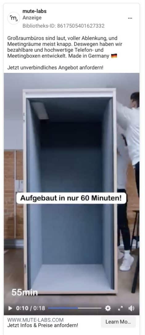
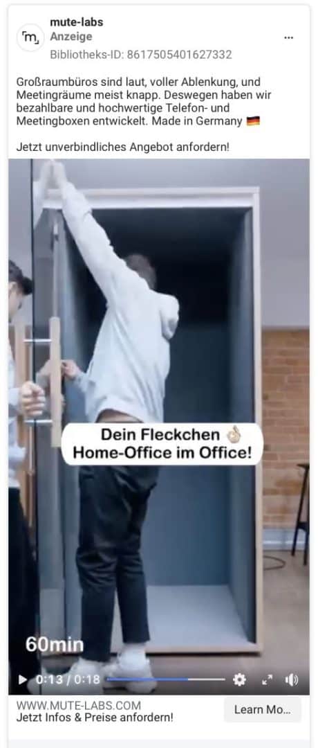
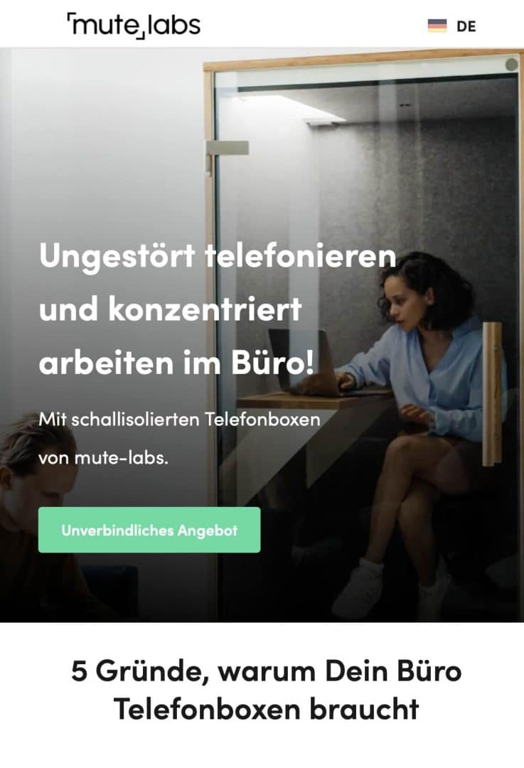
In the text, the ad first addresses the pain points (volume, distraction, scarcity) of the target group, then promises an enticing solution (affordable, high-quality, made in Germany) and calls to action with a clear CTA. The most important benefits are listed in the short video. The headline on the landing page gets to the heart of what the target group wants and ties in directly with the ad – great!
5 design strategies to increase the conversion of your landing page
Be aware: People are not on social media because they are looking for what you are promoting in your ad. They are there to be entertained or inspired. This means that your ad must first arouse the interest of your target group so that they stop scrolling and click on your ad. The landing page must tie in with the promise of the ad and illustrate the next step in the customer journey, leading the user onward, so to speak.
The ad itself corresponds to the awareness phase in the customer journey: the message is clear, precisely tailored to the respective target group and addresses a problem or a desired state – and thus arouses the interest of the relevant people.
Once on the landing page, the consideration and decision phase follows: this is where people find the information announced in the ad and are guided through the process by various confidence-building elements and sales psychology principles, right up to the clear call to action.
You can significantly influence the conversion rate with an appropriate landing page design. In my experience, the following 5 strategies are particularly effective, allowing you to make a big impact with seemingly small adjustments.
Design strategy #1: Clear structure
“A confused head makes no decisions.” Or so the saying goes. In other words: if your landing page is confusing, unstructured, too cluttered, and the like, you will hardly achieve any conversions. Because users unconsciously think: “Before I make a wrong decision, I’d rather not make one at all.”
Make sure that your social ad landing page is clear and well-structured and you will achieve higher conversions.
Design strategy #2: Elements of trust
We humans are herd animals – if others think something is good, we are more inclined to evaluate it favorably. This gives us security and allows us to build trust. In the case of a landing page, this means that we perform the desired action, i.e. click the CTA button.
Confidence-building elements can be, for example
- Customer testimonials and reviews
- Awards, certificates
- Known from bar
- Various badges (e.g. Proven Expert)
- Photos of you
Design strategy #3: Sales psychology principles
Sie sehen gerade einen Platzhalterinhalt von Standard. Um auf den eigentlichen Inhalt zuzugreifen, klicken Sie auf den Button unten. Bitte beachten Sie, dass dabei Daten an Drittanbieter weitergegeben werden.
Weitere InformationenSales psychology is a huge field all of its own, so here are just a few examples that I, as a web designer, believe can influence the success of your landing page:
Depending on which colors you choose, different types of people will feel addressed. Red, for example, is a signal color and primarily appeals to “doers” who want to get things done quickly and reach their goal. Blue signals seriousness, security and reliability and is therefore often used by banks and insurance companies.
Customer testimonials with a photo appear more trustworthy than those without a photo and can therefore help to increase the conversion rate.
A CTA button placed directly in the header area of the landing page has a positive effect on the conversion rate because the “doer” types (see above) can act immediately.
The basic rule is: continue on the landing page what you promised in the ad! Use the same colors and elements (e.g. customer testimonials), stay true to the visual language from the social ad on the landing page, address the same target group as in the ad and don’t suddenly change or broaden it.
Design strategy #4: Visual hierarchy and user guidance
In general, you can influence how visitors perceive the content through the arrangement and design of the individual landing page sections.
Pay attention to a descending text size in the heading hierarchy: The main heading H1 should be the largest text element, which has its prominent appearance at the very top of the header (also known as the above-the-fold area). The H2 for subheadings is slightly smaller, the H3 even smaller, and so on.
You can apply a visual weighting, whereby the principle applies: Larger elements get more attention. Some users scan a page by looking at the largest elements first and only then paying attention to the smaller ones. However, don’t overdo it with the number of large elements, because then their otherwise positive effect will fizzle out.
Use layout elements such as arrows to direct the gaze or reading flow of your visitors. This also works with the direction of the eyes on a photo, for example when they are directed towards a button.
We can help visitors to our landing page to carry out the action we want them to take by focusing on the essentials and leaving out all distracting elements (e.g. menu, links to further pages).
Design strategy #5: Design of the CTA buttons
Sie sehen gerade einen Platzhalterinhalt von Standard. Um auf den eigentlichen Inhalt zuzugreifen, klicken Sie auf den Button unten. Bitte beachten Sie, dass dabei Daten an Drittanbieter weitergegeben werden.
Weitere Informationen“Small button, big effect”, you could say, because you can achieve conversion-boosting effects with the right design of call-to-action buttons.
In my web design practice, 11 do’s have emerged as conversion boosters:
- The CTA button must be recognizable as such and clearly distinguishable from all other content elements.
- The first CTA on a landing page is placed directly in the header area above the fold – this enables immediate interaction, especially for the “doer types”, without them having to scroll and explore the content.
- Color plays an important role, although there is no universal rule here; the choice of color should always be individually tailored to the branding, target group, and theme.
- Consistency: All CTA buttons on a landing page look the same.
- A high contrast between background and text color ensures good legibility.
- Every CTA button needs “air to breathe”, i.e. distance from the surrounding content so that it can work properly.
- The size is appropriate – it should radiate presence, but not “shout” at visitors.
TIP: If the color is very bold and eye-catching, you should reduce the size of your CTA buttons slightly; for softer colors, they can be larger. - White space around the text in the CTA button improves the effect of the text.
- If a CTA button has a hover effect (i.e. if you move the mouse over it, the color changes), this clarifies its function as a button on the one hand and signals that it is clickable on the other.
- I like to design the CTA buttons in the mobile version with 100 percent width (minus the page margin, of course) and sufficient distance to other elements because this significantly improves operation with the finger (keyword: touch-friendliness)
- Sometimes adding a small icon (e.g. arrow or shopping cart) is visually appealing and clarifies the function of the button, which increases the click rate, especially on mobile devices.
Performance analysis of your landing page
Sooner or later, everyone asks themselves: “What is a good conversion rate?” The answer to this question is highly individual and yet extremely important, because only when we know about our conversion rate can we start to make the necessary adjustments to optimize it.
Here is the formula for calculating the conversion rate of your landing page:
Number of actions divided by the number of ALL visitors.
Example: 100 people come to your landing page, 30 of them perform the desired action → 30/100 = 0.3 x 100 → the conversion rate is 30%
Always think of social ads and landing pages as a unit
Even if you’re bursting with creative ideas for the design of your social media ads: don’t rush things and never think of the ads separately, but always in combination with the landing page!
The ad and landing page must appear like a well-coordinated team to the user; the landing page must deliver what the ad promises. Take this principle to heart and combine it with my five design strategies – and watch how your conversion rate develops for the better.
Have you caught fire and would like to optimize your landing page right away, but feel a bit lost on your own? Then I have two options for you:
- In this article, you will learn 7 tips on how to find the right web designer
- Or you can take a look directly at my offer page – maybe I’m the right web designer for you.
All your questions about social media ads and landing pages have been answered, but you are still looking for the right tool for organic social media marketing? Test Swat.io now with no obligation! Use the clear editorial calendar to plan your content and the inbox to ensure you never miss a comment in community management again.
 23. January 2025